Building Apple’s Vision Pro Scrolly Animation with Pure CSS
Introduction
Apple’s product pages are renowned for their captivating scroll-driven animations, often referred to as scrolly teardowns. These animations traditionally rely on JavaScript and other technologies, and they aren’t always responsive—Apple frequently switches to a static image on smaller screens. However, recent advancements in CSS have introduced native scrolling animation capabilities, sparking the question: can one of these sophisticated animations be rebuilt using only CSS, and can it be fully responsive? This article explores the recreation of the stunning Vision Pro component animation, which reveals the device’s internal hardware through a multi-stage scrolling effect.
The Original Animation
On the Vision Pro product page, after scrolling past the hero section, users encounter a black background with an immersive animation. The animation unfolds in two distinct stages, each designed to showcase the device’s intricate layers and final form.
Stage 1: The “Exploding” Hardware
Three electronic components rise sequentially from the base of the screen, each comprised of layered images that create a 3D depth effect. The outermost component acts as both the frontmost and hindmost layer, wrapping around the middle component, which in turn envelops the innermost piece. This clever use of transparency and layering gives the illusion of components floating and interlocking.
- Outer layer (sub roll): Appears both in front of and behind the middle layer.
- Middle layer (hot dog bun): Wraps around the third component, adding depth.
- Inner layer (bread stick): The central piece, visible through transparent areas of the outer layers.
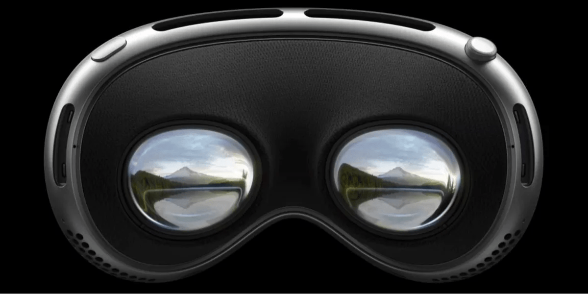
Stage 2: Flip-Up to Eyepieces
Once the hardware finishes exploding, the entire device flips upward in a smooth motion to reveal the eyepieces. Apple implements this part using a video, where scrolling controls the video timeline via JavaScript.
Recreating with Pure CSS
The goal was to replicate both stages using only CSS, making the animation responsive across devices. The original approach leaned heavily on JavaScript and fixed positioning, but a CSS-only solution required rethinking layout and scroll interaction.
Approach and Techniques
Apple’s images were used directly—six background-image layers, each positioned at background-position: bottom center. This avoids the pitfalls of <img> tags and allows easy scaling. The key breakthrough was using background-size: cover or contain to ensure responsiveness.
- Fixed positioning dropped: Instead of
position: fixed(which caused images to overflow on narrow screens), a combination ofposition: stickyand viewport-relative units kept the images anchored without breaking the scroll flow. - Scroll-driven animation: CSS
animationtied toscroll()triggers (using theanimation-timelineproperty) controlled the sequential appearance of each component. - Layering order: A
z-indexstacking technique recreated the “sub roll” effect, with each layer partially transparent to show layers beneath.
Challenges and Solutions
The main hurdles were responsiveness and browser compatibility. Initially, using position: fixed made the images escape the viewport on narrow screens. The fix involved switching to a sticky container that stays at the bottom until triggered by scroll, while using background-size: cover to maintain aspect ratio. Additionally, the video-based flip-up stage was replaced by a CSS animation that shifts the device’s transform (rotateX) based on scroll progress.
At the time of writing, this CSS-only approach works in Chrome and Safari but not in Firefox, due to partial support for animation-timeline: scroll(). In Firefox, users will see a static fallback image.
Implementation Summary
The final code uses:
- Scroll containers with
position: stickyto keep the animation zone fixed while scrolling. - Multiple background layers on a single element, animated via
@scroll-timelineandanimation. - Keyframes that control opacity, scale, and translation of each component to mimic the rising and flipping effects.
Conclusion
Recreating Apple’s intricate scroll animation with pure CSS is not only possible but also yields a responsive, lightweight implementation. While browser support remains a limitation, the approach demonstrates how far CSS has come in handling complex interactions once reserved for JavaScript. As browser vendors continue to adopt scroll-driven animations, such CSS-only techniques will become more robust and widely compatible.
For a live demo, check the original project on CodePen (link placeholder). The code is open-source and adaptable for other product pages wanting to emulate Apple’s visual storytelling without heavy JavaScript dependencies.